Micro Floral Prints vs. Bold Cottagecore Botanicals: Which Summer Pattern Flatters You Best?
The practical difference between micro florals and bold cottagecore botanicals is print scale, and scale changes two things: how the pattern reads from a distance and how much visual attention it takes from the cut of the garment. Micro florals blur toward a soft solid color from a few feet away and let the silhouette lead. Bold botanicals stay legible across a room and become the focal point themselves. Which one suits you is a question about what you want noticed, the setting, and the light — not about your measurements.
What print scale actually does
Every printed fabric has a repeat: the distance before the pattern starts over. A micro floral might repeat every half inch. A large botanical might repeat every eight or ten.
At close range you see both patterns clearly. At conversational distance, roughly six to ten feet, the small repeat begins to optically blend, and what the eye registers is an overall color rather than individual flowers. That blended color is usually a mid-tone average of the print. The large repeat does not blend at any normal distance; you still see stems, blooms and background as separate elements.
This is the single most useful fact about choosing a print, because most of the time people look at fabric from six inches away on a screen and then wear it at ten feet in daylight.
Micro florals versus bold botanicals, compared
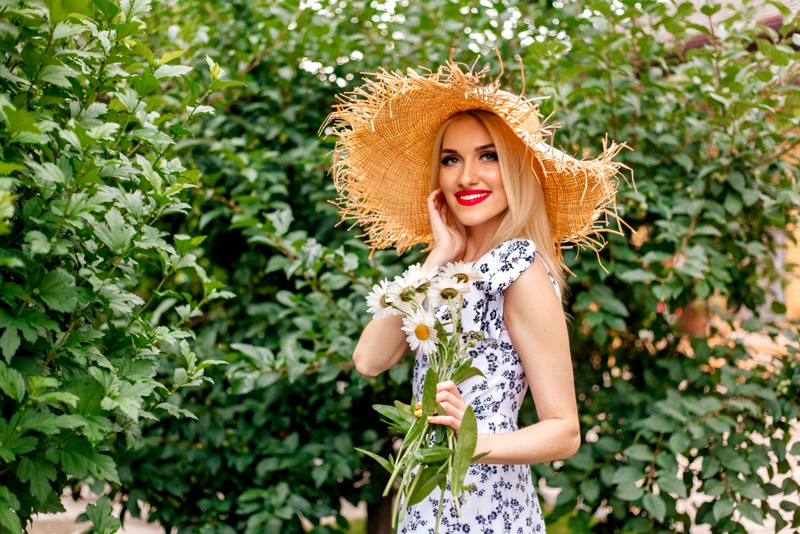
Photo by Karina Rymarchuk on Pexels
| Consideration | Micro floral | Bold cottagecore botanical | |---|---|---| | How it reads at ten feet | Blends toward a soft solid color | Stays fully legible as a pattern | | What leads the outfit | The cut and silhouette of the garment | The print itself | | Against a green garden background | Can recede, especially in green tones | Separates clearly | | In photographs | Calm, low visual noise | High impact, strong at a distance | | Formality | Reads slightly more restrained | Reads festive and summery | | Ease of accessorizing | Simple; treat it as a near-solid | Needs restraint; one neutral or one pulled accent | | Pairing with structure | Lets bodice seams and a defined waist show clearly | Competes unless the construction is strong | | Seasonal range | Works spring through early autumn | Reads firmly high summer |
Neither column is the better choice in general. The table is a set of trade-offs, and the right answer changes with the event.
Which print suits which situation
Rather than sorting prints by body type, sort them by context. This produces better decisions and is honest about how prints actually work.
- A garden party on a lawn. Bold botanicals win on visibility. A green-heavy micro floral can visually disappear into hedges and grass in photographs.
- A formal daytime event with a dress code. Micro florals read a notch more restrained, which is useful when you want dressed-up rather than festive.
- A structured, seamed garment. Micro florals let the construction show. If you chose a dress for its bustier seams and defined waist, a smaller print keeps those lines visible.
- A simple, unstructured shape. Bold botanicals give a plain silhouette something to say. This is why loose prairie dresses so often carry big prints.
- Bright midday sun. High-contrast bold prints hold up. Low-contrast micro prints can wash out.
- Indoor or overcast light. Micro florals keep their subtlety; bold prints can look heavier than they did outdoors.
Color contrast matters as much as scale
Scale gets all the attention, but contrast within the print does at least as much work.
A bold print in closely related tones — cream, blush and sand, for instance — behaves more like a micro floral than like a high-contrast one, because there is not enough tonal difference for the eye to pick out individual shapes at a distance. Conversely, a micro floral in strong contrast, such as white flowers on navy, stays surprisingly legible even at a small repeat.
So the useful mental model is a grid with two axes: scale and contrast. High scale plus high contrast is maximum impact. Low scale plus low contrast is nearly a solid. The two mixed cases sit in the middle, and they are often the most versatile prints in a wardrobe.
Three practical guidelines follow from this:
How print interacts with a structured garment
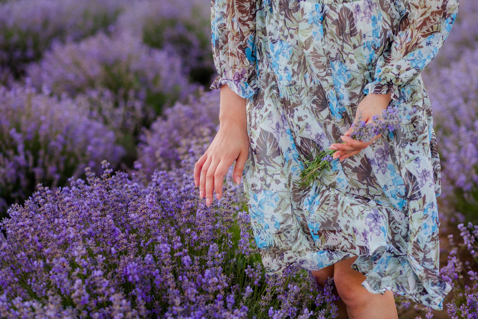
Photo by Natalie Bond on Pexels
A structured dress and a bold print are both trying to lead. That is not automatically a problem, but it is worth deciding which one you want in front.
On a garment with strong construction — a fitted bustier top, visible vertical seams, a cinched waist from a lace-up back, a slit down one side of the skirt — the lines survive a busy print, because the seams create their own shadows and edges that the eye follows regardless of pattern. That is why colorful, printed bustier sundresses work while the same print on a shapeless shift can look like a swathe of fabric.
If you want the construction to be the story, choose a smaller repeat or a lower-contrast print. If you want color and pattern to be the story, go bold and let the construction do its work quietly. Both are legitimate, and it is genuinely a preference rather than a rule. There is more on how the print and the cut share visual work in the notes on floral midriff dresses and confidence in styling.
Cottagecore botanicals: what the aesthetic actually calls for
The cottagecore print vocabulary is fairly specific. It leans toward garden species rather than tropical ones: roses, sweet peas, foxgloves, daisies, wildflower meadows, trailing vines, and ditsy scatter patterns on light grounds. Colors run soft — cream, butter, sage, dusty rose, faded blue — even when the print scale is large.
That combination of large scale and soft color is why cottagecore prints often read as romantic rather than loud. It is also why they photograph well outdoors, since the tonal softness keeps them from fighting a green background while the scale keeps them legible.
If that is the register you want, prioritize the color palette over the scale. A large print in muted garden tones will land closer to cottagecore than a small print in bright saturated color. The cottagecore styling guide for a floral bustier dress covers how to build the rest of the outfit around that palette.
Frequently asked questions
Do small prints make you look smaller and large prints larger? That is an old rule of thumb and it does not hold up well. What print scale reliably changes is where attention goes: a small, low-contrast print draws the eye to the garment's shape and your proportions, and a large, high-contrast print draws it to the fabric. Both effects are useful depending on what you want emphasized. Choose by intent and setting rather than by that rule.
Which print scale is more versatile across a summer? Micro florals and mid-scale prints in two or three colors generally get more wear, because they behave like near-solids and accept whatever shoes and bag you already own. A big statement botanical is memorable, which cuts both ways: it makes a strong impression and it gets recognized in photographs.
How do you accessorize a bold botanical print? Pick one color from the smallest repeated element in the print and use it once, or go entirely neutral. Avoid matching the boldest color in the print exactly, since exact matching in a multicolor pattern tends to look accidental. Woven, raffia and tan leather textures work particularly well with garden botanicals.
Can you mix a floral dress with other patterns? Yes, if the scales are clearly different. A large botanical with a fine stripe reads as deliberate; two prints at similar scale reads as a clash. Keep one color in common between them and let one print be clearly dominant.
A practical next step
Take the print you are considering, view it on a screen at arm's length, then step back six feet and look again. Note what you see at that distance — a pattern or a color. That answer tells you whether the print or the garment's cut will lead the outfit, which is the actual decision you are making. From there, choose accessories that support whichever one you picked, and the rest of the styling follows. The general styling guide for a floral bustier dress is a useful next read for putting the whole outfit together.
Cover photo by Nadin Nadin on Pexels.